Next, let’s build scatter plots displaying the relationship between tip amount, tip percentage, and fare amount, using the Analytic Solver Data Science Chart Wizard. The left-hand chart below illustrates the linear relationship between tip amounts and fare amounts -- and another pattern of lines. In the right-hand chart, we show tip percentage scattered against fare amount, which shows the same pattern:

Both of these charts show the effectiveness of the "suggested tip percentages" on the credit card entry keypad found in most taxi cabs. Enough riders choose the 20%, 25% and 30% buttons to show up on the scatter plots.
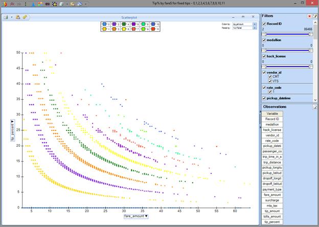
There are other interesting patterns in the data. We see several “exponential drops” on the “Tip% / Fare amount” chart, that correspond to horizontal lines on the ”Tip amount / Fare amount” chart -- suggesting that a fair number of riders pay fixed tips such as $1, $2, $3, … no matter what the fare amount is. This can be confirmed by visualizing the same data, filtered and colored for discrete tip amounts (a simple point-and-click step in Analytic Solver Data Science):
Next, let’s see if we can visually discover any interesting information about how trip distance and time affect the tip.
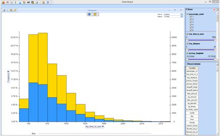
Here's a histogram of our data binned by trip time, colored by our binary variable indicating tips of 20% or more (yellow) versus tips less than 20% (blue):
And here's a histogram of data binned by trip distance. Again yellow indicates tips of 20% or more, blue indicates tips less than 20%:
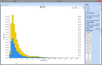
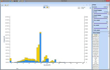
Somewhat to our surprise, there's little difference in the distribution of high versus low tip percentages based on either trip time or trip distance. Many other visualizations are possible -- Here is one, that suggests we should include the vendor_binary variable as a feature for our predictive model: the distribution of tip percentages is rather different for taxis equipped with the CMT machines versus the VTS machines.
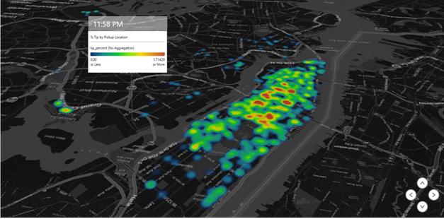
Visualizations using the GPS coordinates of pickup locations in the dataset can be used to map the taxi fare data. In this one, created using the free Excel PowerMap add-in, we can see the hotspot pickup neighborhoods that lead to a higher percentage tip, and see how this changes by time of day.
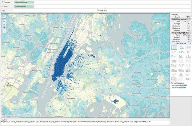
The Analytic Solver Data Science Chart Wizard includes "instant export" buttons for Tableau and Power BI, each of which provides a wide range of visualization options. In this one, we created a map with taxi trips plotted and colored by tip percentage – with the underlying data layer showing Median Household Income (2014).
Given what we've learned through visual data exploration, we can proceed to develop a predictive model. With Analytic Solver Data Science, that's a point-and-click operation without any programming, as shown on the next page.
