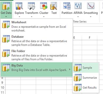
Now, we'll draw a representative random sample, and use what we've learned from the full dataset to preprocess, clean and explore its properties. These steps will also prepare our data for predictive modeling. Obtaining the data is easy -- and extremely fast -- with Analytic Solver Data Science's menu option Get Data - Big Data - Sample:

Simple dialog options let us randomly sample about 0.05% of the 173 million records – yielding about 86,000 rows of data in Excel.
Filtering and Feature Extraction
A typical next step in data analysis involves filtering out erroneous, unusual or irrelevant data. We'll follow the same steps as in Jose Mazo's GitHub thesis, to help us compare our predictive model to his. Here's a summary of filters:
- rate_code={1} – makes up 97.73% of all 2013 taxi trips
- passenger_count={1..6} – removing corrupted data with 0 or more than 100 passengers.
- trip_time_in_secs=(0,3600] – removing corrupted data with negative or abnormally long taxi trips
- trip_distance=(0,25] – limiting taxi ride to 25 miles
- pickup_longitude/dropoff_longitude=[-74.361107,-71.903083] – filtering out erroneous data about trips in the ocean or outside of New York
- pickup_latitude/dropoff_latitude=[40.459518,41.175342] – limiting the area to central NYC area
- payment_type={CRD} – very important to remove fares with cash payments, since actual tips are unknown, but data shows them as 0
- surcharge={0,0.5,1}
- mta_tax={0.5}
- tip%=[0,50%] – done to match the GitHub analysis -- tips over 50% are a tiny portion of the data
In the thesis, these filters are applied with fairly simple (for programmers) Python code -- but since Analytic Solver Data Science produces Excel tables, filtering is an even simpler point-and-click step, applied to the columns.
Next, we create a new calculated column: tip_percent = (fare_amount + mta_tax + surcharge) / fare_amount * 100%, that we'll use later. Again this is trivially simple to do in an Excel table.
Finally, we want to extract elements from the "pickup_datetime" and create new columns, that we can use as variables or features in our predictive model:
- month, day hour, minute (each an integer)
- is_friday_saturday (binary) – to test whether tipping is different on these days
We'll also create a binary variable from the field for "vendor ID":
- vendor_binary = 0 if CMT and 1 if VTS
We'll use one other binary variable to distinguish higher from lower tip percentages -- this will be the "outcome variable" when we train a predictive model
- tip_binary = 1 if >20%, 0 otherwise
The above filtering steps reduce the sampled dataset from about 86,000 rows to 44,404 records in total. Before proceeding, let's perform a quick visual check on the data:
Exploring the Data Sample
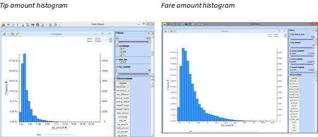
Earlier, we looked at fare and tip amounts on an aggregated basis. Now, we'll look at the "drill-down" data by medallion that we've brought into Excel. We'll again use Analytic Solver Data Science's Chart Wizard to quickly produce histograms of the tip and fare amounts. Switching between tip amount, fare amount, and tip percentage on the chart vertical axis takes just two clicks:

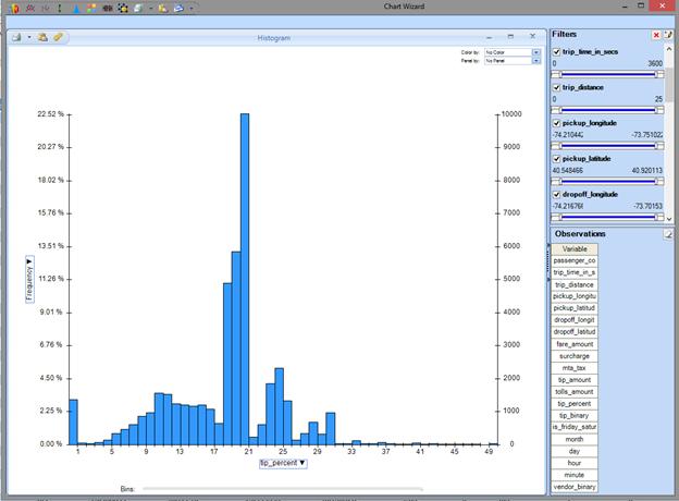
Here's a closer look at the distribution of tip percentages across our data sample. We can see right away that there's a significant dropoff at the 20% level, reflecting what most riders consider a "very good tip". As in the GitHub thesis, we'll use that threshold in building our predictive model.

Our random sample, which is representative of the entire dataset over time, is actually smaller than the single-month sample used in the GitHub thesis. But we can see that this histogram is similar to the one depicted in the thesis.
Now that we've done the less glamorous -- but rather easy to do -- data cleanup in Excel, we can start visually exploring the data in more interesting ways -- as shown on the next page.
