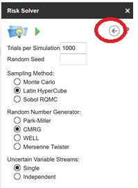
We are now ready to run a simulation. Click the Options icon to open the Simulation options pane.

In this pane, you can set the number of trials per simulation, the random seed, sampling method, random number generator, and/or random number streams. See the Add-on Reference chapter that appears later on in this guide for descriptions of each option. For now, click the back arrow to return to the Outputs pane.
To ensure the current model is run, we will first save our workbook to our Google documents directory, then click the green arrow to run a simulation.

In the blink of an eye, your first Monte Carlo simulation is complete! Check the Outputs tab to view a frequency chart for the output function in cell B12. This chart displays a histogram of the 1000 trial values recorded during the simulation.
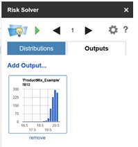
Click the frequency chart for cell B12 to display statistics, percentiles, sensitivity, and correlations information for the output function.
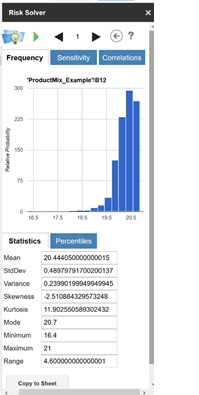
On the Frequency tab, you'll find a histogram of the 1000 trial values along with statistics calculated from the output function such as Mean and standard deviation. Recall in our static model that the Total Revenue was calculated as $19,500. Now we see that the average Total Revenue is $22.444 or $22,444. However, note that the Minimum and Maximum values show that the total revenue can dip to a low of $16,400 and a high of $21,000.
Click Copy to Sheet to copy all statistics to your Google spreadsheet.
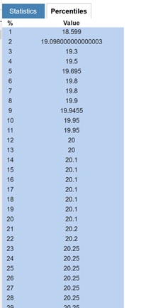
We can see that the 10% percentile is $19.95 (or 19,950) – if we sell 110 tickets, we’ll earn approximately as much revenue as a full flight (100 seats * $200) 90% of the time. You can see why airlines find that overbooking makes sense as a policy!
The Sensitivity tab displays a “Tornado chart” that shows you how much Total Revenue changes with a change in the uncertain variable – the LogNormal distribution in cell B4. In this model there is only one uncertain variable, but in a large model with many such variables, it’s usually not obvious which ones have the greatest impact on outcomes such as Total Revenue. A Tornado chart highlights the key variables: B4 has a positive correlation with Total Revenue.
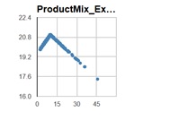
The Correlations tab shows you quick scatter plot of this uncertain function against one or more uncertain variables, or other uncertain functions. In this example – shown on the next page – it shows a scatter plot of B12 (total revenue) against B4.
