Generate Data Example
This example utilizes the Heart Failure example dataset (Chicco & Jurman, 2020) to illustrate how to generate synthetic data using Analytic Solver Data Science.
Inputs
Open the Heart Failure dataset by clicking Help - Example Models - Forecasting/Data Science Examples – Heart Failure. This example dataset contains information pertaining to patients presenting with heart failure as seen in a cardiology clinic.
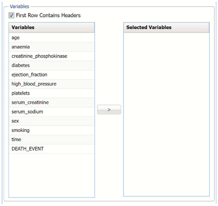
Confirm that the heart_failure_clinical_records tab is selected, and click Generate Data on the Data Science ribbon to bring up the Generate Synthetic Data tab.
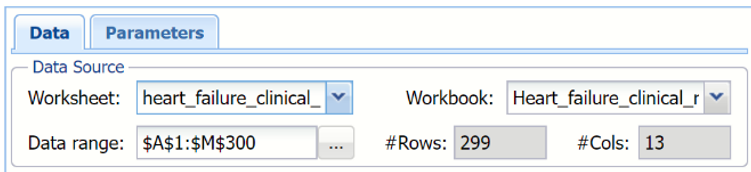
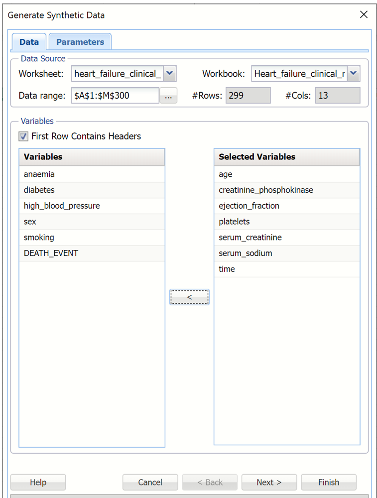
The top of the dialog displays the information for the Data Source: Worksheet name, heart_failure_clinical_records, Workbook name, Heart_failure_clinical_records, the data range, A1:M300 and the number of rows and columns in the dataset.
Data Source section of Generate Synthetic Data tab
This example utilizes the Heart Failure example dataset (Chicco & Jurman, 2020) to illustrate how to generate synthetic data using Analytic Solver Data Science.
Open the Heart Failure dataset by clicking Help - Example Models - Forecasting/Data Science Examples – Heart Failure. This example dataset contains information pertaining to patients presenting with heart failure as seen in a cardiology clinic.
Confirm that the heart_failure_clinical_records tab is selected, and click Generate Data on the Data Science ribbon to bring up the Generate Synthetic Data tab.
The top of the dialog displays the information for the Data Source: Worksheet name, heart_failure_clinical_records, Workbook name, Heart_failure_clinical_records, the data range, A1:M300 and the number of rows and columns in the dataset.
Data Source section of Generate Synthetic Data tab
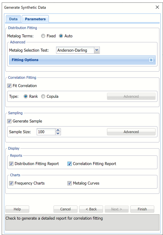
Click Next to move to the Parameters tab.
Populated Generate Synthetic Data, Data tab
For this example, select Auto and leave Metalog Selection Test at the default setting of Anderson-Darling.
Metalog Terms:
- If Fixed is selected, Analytic Solver will attempt to fit and use the Metalog distribution with the specified number of terms entered into the # Terms column. (Only 1 distribution will be fit.) If Fixed is selected, Metalog Selection Test is disabled.
- If Auto is selected, Analytic Solver will attempt to fit all possible Metalog distributions, up to the entered value for Max Terms, and select and utilize the best Metalog distribution according to the goodness-of-fit test selected in the Metalog Selection Test menu.
Click the down arrow on the right of Fitting Options to enter either the maximum number of terms (if Auto is selected) or the exact number of terms (if Fixed is selected) for each variable as well as a lower and/or upper bound. By default the lower and upper bounds are set to the variable’s minimum and maximum values, respectively. If no lower or upper bound is entered, Analytic Solver will fit a semi- (with one bound present) or unbounded (with no bounds present) Metalog function.
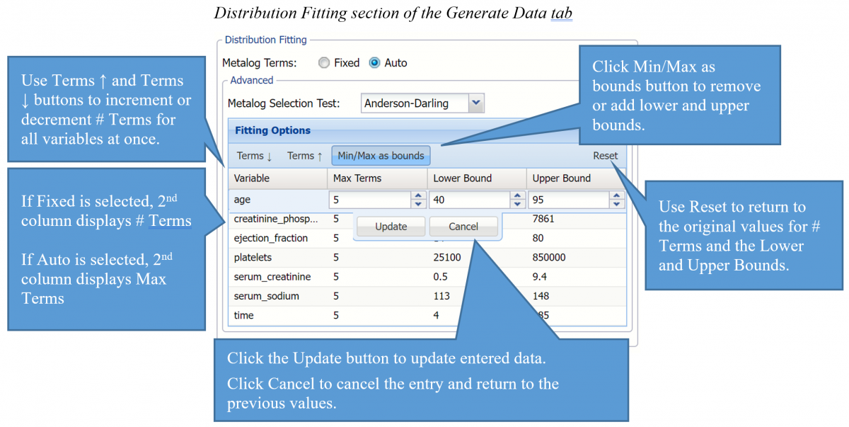
Metalog Selection Test: Click the down arrow to select the desired Goodness-of-Fit test used by Analytic Solver. The Goodness of Fit test is used to select the best Metalog form for each data variable among the candidate distributions containing a different number of terms, from 2 to the value entered for Max Terms. The default Goodness-of-Fit test is Anderson-Darling.
Metalog Selection Test menu
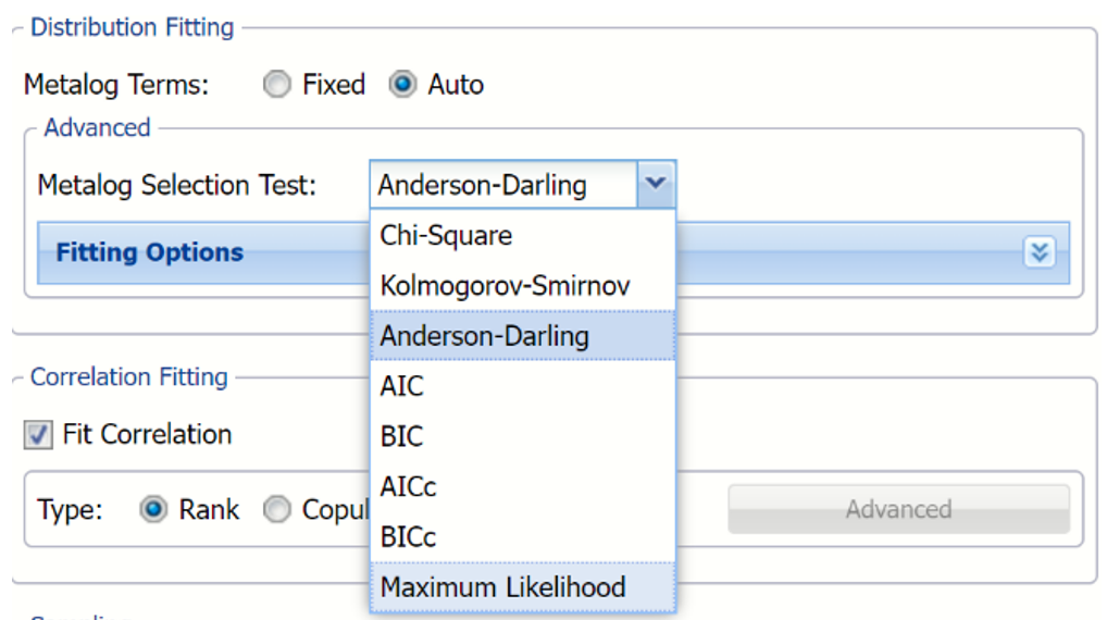
Goodness of Fit Tests:
- Chi Square – Uses the chi-square statistic and distribution to rank the distributions. Sample data is first divided into intervals using either equal probability, then the number of points that fall into each interval are compared with the expected number of points in each interval. The null hypotheses is rejected using a 90% significance level, if the chi-squared test statistic is greater than the critical value statistic.
Note: The Chi Square test is used indirectly in continuous fitting as a support in the AIC test. The AIC test must succeed in fitting as this is a necessary condition as well as the fitting of at least one of the tests, Chi Squared, Kolmogorov-Smirnoff, or Anderson-Darling.
- Kolmogorov-Smirnoff –This test computes the difference (D) between the continuous distribution function (CDF) and the empirical cumulative distribution function (ECDF). The null hypothesis is rejected if, at the 90% significance level, D is larger than the critical value statistic.
- Anderson (Default) -Darling –Ranks the fitted distribution using the Anderson Darling statistic, A2 . The null hypothesis is rejected using a 90% significance level, if A2 is larger than the critical value statistic. This test awards more weight to the distribution tails then the Kolmogorov-Smirnoff test.
- AIC – The AIC test is a Chi Squared test corrected for the number of distribution parameters and sample size. AIC = 2 * p – 2 + ln(L) where p is the number of distribution parameters, n is the fitted sample size (number of data points) and ln(L) is the log-likelihood function computed on the fitted data.
- AICc –When the sample size is small, there is a significant chance that the AIC test will select a model with a large number of parameters. In other words, AIC will overfit the data. AICc was developed to reduce the possibility of overfitting by applying a penalty to the number of parameters. Assuming that the model is univariate, is linear in the parameters and has normally-distributed residuals, the formula for AICc is: AICc = AIC + 2 * p *(p + 1) / (n - p − 1) where n = sample size, p = # of parameters. As the sample size approaches infinity, the penalty on the number of parameters converges to 0 resulting in AICc converging to AIC.
- BIC – The Bayesian information criterion (BIC) is defined as: BIC = ln(n) * p - 2 * ln(L) where p is the number of distribution parameters, n is the fitted sample size (number of data points) and ln(L) is the log-likelihood function computed on the fitted data.
- The BICc is the alternative version of BIC, corrected for the sample size BICc = BIC + 2 * p * (p + 1) / (n – p - 1).
- Maximum Likelihood – The (negated) raw value of the estimated maximum log likelihood utilized in tests described above.
Select Fit Correlation to fit a correlation between the variables. If this option is left unchecked, correlation fitting will not be performed. Leave Rank, the default setting, selected for Type.
If Rank is selected Analytic Solver will use the Spearman rank order correlation coefficient to compute a correlation matrix that includes all included variables.
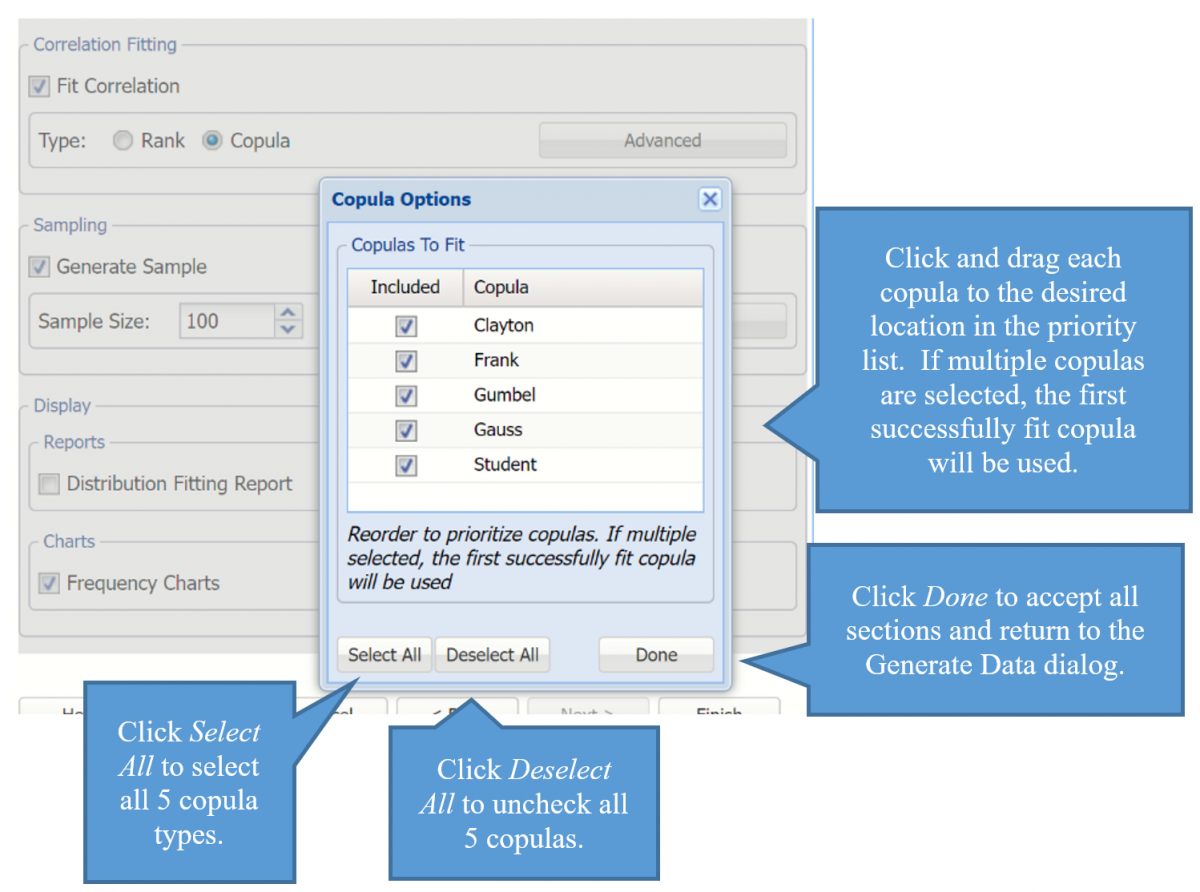
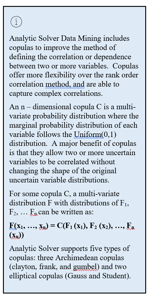
Selecting Copula opens the Copula Options dialog where you can select and drag five types of copulas into a desired order of priority.
Correlation Fitting section of the Generate Data tab

Select Generate Sample to generate synthetic data for each selected variable. Use the Sample Size field to increase the size of the sample generated. Keep the default of 100.
If this option is left unchecked, variable data will be fitted to a Metalog distribution and also correlations, if Fit Correlation is selected, but no synthetic data will be generated.
Click Advanced to open the Sampling Options dialog.
Sampling Options dialog
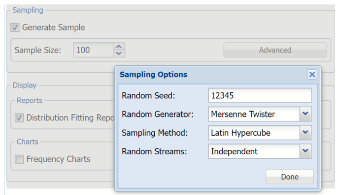
From this dialog, users can set the Random Seed, Random Generator, Sampling Method and Random Streams.
Random Seed: Setting the random number seed to a nonzero value (any number of your choice is OK) ensures that the same sequence of random numbers is used for each simulation. When the seed is zero or the field is left empty, the random number generator is initialized from the system clock, so the sequence of random numbers will be different in each simulation. If you need the results from one simulation to another to be strictly comparable, you should set the seed. To do this, simply type the desired number into the box. (Default Value = 12345)
Random Generator: Use this menu to select a random number generation algorithm. Analytic Solver Data Science includes an advanced set of random number generation capabilities.
Computer-generated numbers are never truly “random,” since they are always computed by an algorithm – they are called pseudorandom numbers. A random number generator is designed to quickly generate sequences of numbers that are as close to statistically independent as possible. Eventually, an algorithm will generate the same number seen sometime earlier in the sequence, and at this point the sequence will begin to repeat. The period of the random number generator is the number of values it can generate before repeating.
A long period is desirable, but there is a tradeoff between the length of the period and the degree of statistical independence achieved within the period. Hence, Analytic Solver Data Science offers a choice of four random number generators:
- Park-Miller “Minimal” Generator with Bayes-Durham shuffle and safeguards. This generator has a period of 231-2. Its properties are good, but the following choices are usually better.
- Combined Multiple Recursive Generator of L’Ecuyer (L’Ecuyer-CMRG). This generator has a period of 2191, and excellent statistical independence of samples within the period.
- Well Equidistributed Long-period Linear (WELL) generator of Panneton, L’Ecuyer and Matsumoto. This generator combines a long period of 21024 with very good statistical independence.
- Mersenne Twister (default setting) generator of Matsumoto and Nishimura. This generator has the longest period of 219937-1, but the samples are not as “equidistributed” as for the WELL and L-Ecuyer-CMRG generators.
- HDR Random Number Generator, designed by Doug Hubbard. Permits data generation running on various computer platforms to generate identical or independent streams of random numbers.
Samplng Method: Use this option group to select Monte Carlo, Latin Hypercube, or Sobol RQMC sampling.
- Monte Carlo: In standard Monte Carlo sampling, numbers generated by the chosen random number generator are used directly to obtain sample values. With this method, the variance or estimation error in computed samples is inversely proportional to the square root of the number of trials (controlled by the Sample Size); hence to cut the error in half, four times as many trials are required.
Analytic Solver Data Science provides two other sampling methods than can significantly improve the ‘coverage’ of the sample space, and thus reduce the variance in computed samples. This means that you can achieve a given level of accuracy (low variance or error) with fewer trials.
- Latin Hypercube (default): Latin Hypercube sampling begins with a stratified sample in each dimension (one for each selected variable), which constrains the random numbers drawn to lie in a set of subintervals from 0 to 1. Then these one-dimensional samples are combined and randomly permuted so that they ‘cover’ a unit hypercube in a stratified manner.
- Sobol RQMC (Randomized QMC). Sobol numbers are an example of so-called “Quasi Monte Carlo” or “low-discrepancy numbers,” which are generated with a goal of coverage of the sample space rather than “randomness” and statistical independence. Analytic Solver Data Science adds a “random shift” to Sobol numbers, which improves their statistical independence.
Random Streams: Use this option group to select a Single Stream for each variable or an Independent Stream (the default) for each variable.
If Single Stream is selected, a single sequence of random numbers is generated. Values are taken consecutively from this sequence to obtain samples for each selected variable. This introduces a subtle dependence between the samples for all distributions in one trial. In many applications, the effect is too small to make a difference – but in some cases, better results are obtained if independent random number sequences (streams) are used for each distribution in the model. Analytic Solver Data Science offers this capability for Monte Carlo sampling and Latin Hypercube sampling; it does not apply to Sobol numbers.
In the Display section, keep Distribution Fitting Report and Correlation Fitting Report selected. Select Frequency Charts and Metalog Curves.
Generate Synthetic Data Tab, Display section of Parameters tab
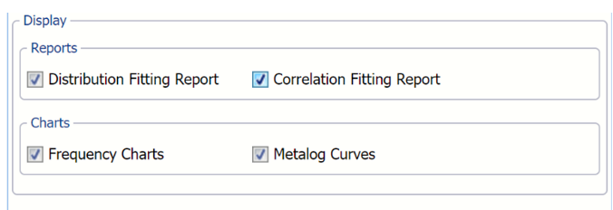
Distribution Fitting Report: Report included on the SyntheticData_Output worksheet includes the number of terms, the coefficients for each term, the lower and upper bounds and the goodnesss of fit statistics used when fitting each Metalog distribution.
Correlation Fitting Report: Displays the correlation matrix SyntheticData_Output worksheet
Frequency Charts: Displays the multivariate chart produced by the Analyze Data feature. Double click each chart to view an interactive chart and detailed data (statistics, percentiles and six sigma indices) about each variable included in the analysis. For more information on the Analyze Data feature included in the latest version of Analytic Solver Data Science, see the Exploring Data chapter that appears later in this guide.
Metalog Curves: Select this Chart option to add Metalog distribution curves to each variable displayed in the multivariate chart and interactive charts described above for Frequency Charts.
Click Finish.
Generate Synthetic Data, Parameters tab
Results
With the selected options shown in the screenshot above, two workbooks will be inserted into the workbook, SyntheticData_Output and SyntheticData_Sample.
At the top of both worksheets is the Output Navigator. Click any link to easily navigate to that section of the worksheet.
SyntheticData_Output: Output Navigator
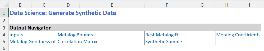
SynthethicData_Output
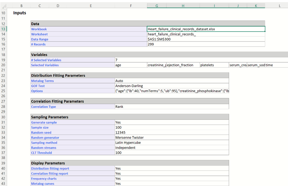
Scroll down to the Inputs section of the SyntheticData_Output worksheet to view all user inputs including the data source, the selected variables, the distribution fitting parameters, correlation fitting parameters, sampling parameters and display parameters.
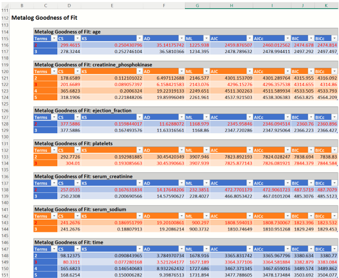
Distribution Fitting Report: If Distribution Fitting Report was selected on the Parameters tab on the Generate Data dialog, the Distribution Fitting Report will be inserted into the SyntheticData_Output worksheet. This report contains information for each of the fitted Metalog distributions, such as:
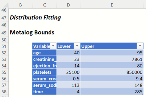
- Metalog Bounds: This table shows the lower and upper bounds as entered in the Fitting Options section of the Generate Synthetic Data dialog, Parameters tab.
SyntheticData_Output: Metalog Bounds report
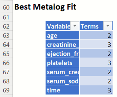
Best Metalog Fit:
- If Auto is selected for Metalog Terms, this table displays the number of terms for the best Metalog distribution for each variable, as decided by the selected Goodness-of-Fit test.
- If Fixed is selected for Metalog Terms, this table displays the number of terms for the (only) Metalog distribution fit for each variable.
SyntheticData_Output: Best Metalog Fit report
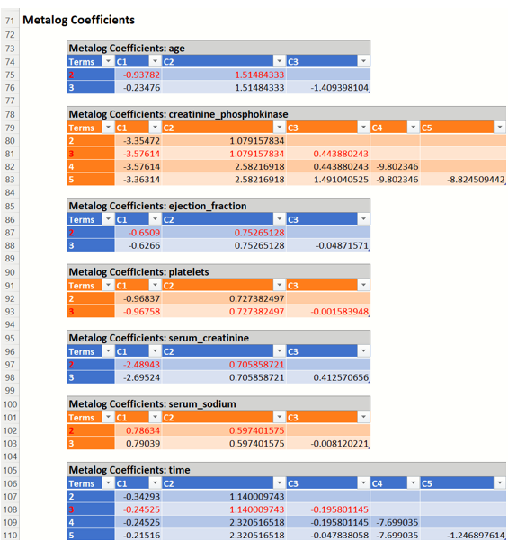
- Metalog Coefficients: This table shows the fitted coefficients for all feasible Metalog distributions that Analytic Solver Data Science attempted to fit for each variable. The best distribution (as decided by the chosen Goodness-of-Fit test) that will be used in sample generation (if requested) is highlighted in red.
Note that it is not guaranteed that all possible Metalog distributions will be fit. As shown in the screenshot below, not all variables have exactly 5 Metalog distributions for 1, 2, 3, 4 and 5 terms.
SyntheticData_Output: Metalog Coefficients report
- Metalog Goodness-of-Fit: This table shows the Goodness-of-Fit test statistics for all feasible Metalog distributions that Analytic Solver Data Science attempted to fit for each variable. As in the Metalog Coefficients report, the best distribution (as decided by the chosen Goodness-of-Fit test) that will be used in sample generation (if requested) is highlighted in red.
SyntheticData_Output: Metalog Goodness of Fit report
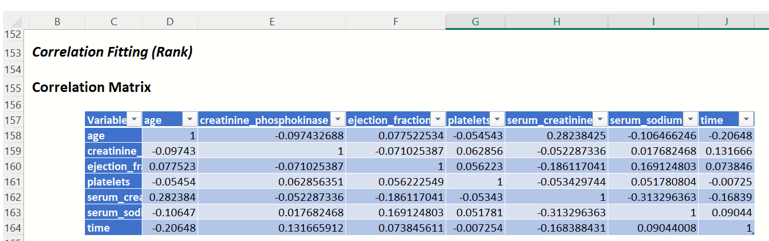
Correlation Fitting Report: If Correlation Fitting Report is selected on the Parameters tab of the Generate Data dialog, the Correlation Fitting Report will be inserted on the SyntheticData_Output worksheet.
This report contains the Correlation Matrix containing the correlations between variables using the correlation technique selected, Rank or Copula.
SyntheticData_Output: Correlation Matrix
SynthethicData_Sample
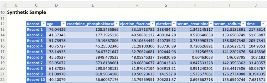
Click the SyntheticData_Sample worksheet to view the synthetic data for each selected variable. (Recall that this data is available because Generate Data was selected on the Parameters tab on the Generate Data dialog.) This worksheet also includes the Output Navigator as described above for the SyntheticData_Output worksheet.
Recall that to produce this synthetic data, Analytic Solver:
- For each selected variable, Analytic Solver first fit the original data to a Metalog distribution by using either a fixed number of terms or the automatic search option.
- Afterwards, Analytic Solver fit a correlation to all variables by using either Rank Correlation or one of the five available copulas.
- Lastly, the trial values (i.e. synthetic data) were generated using the fitted distribution and correlations.
The screenshot below displays the first 10 trial values generated for each selected variable: age, creatinine_phosphokinase, ejection_fraction, platelets, serum_creatinine, serum_sodium and time.
SytheticData: Sample: Synthetic Sample
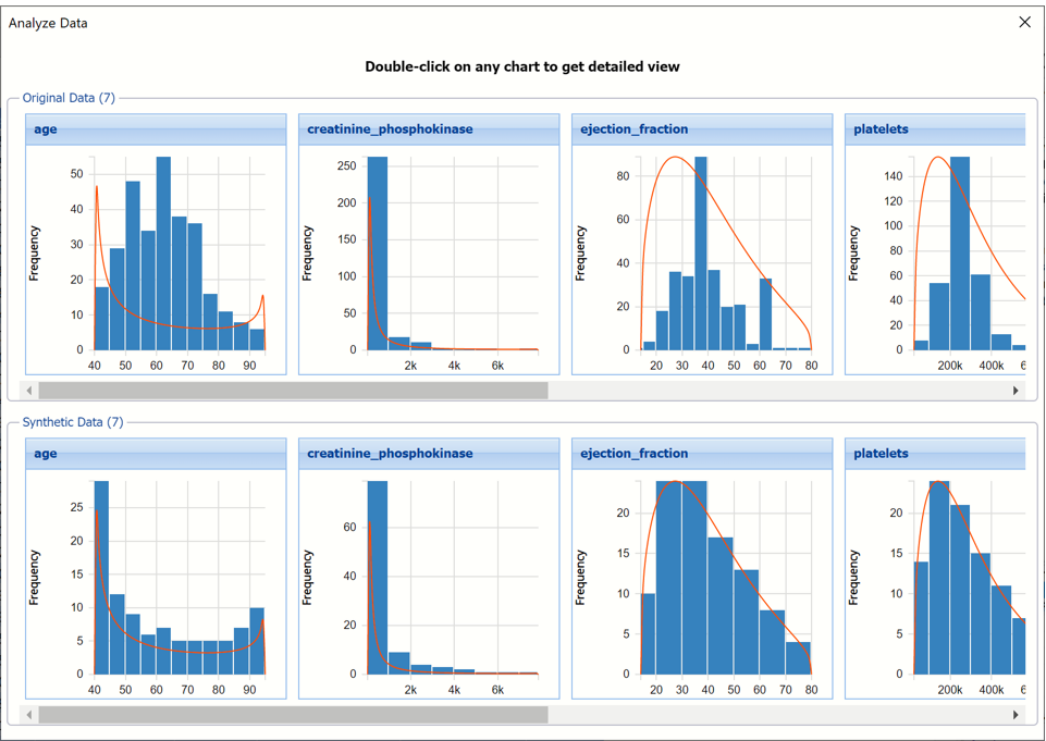
If the Frequency Chart Option was selected on the Parameters tab of the Generate Data dialog, a dialog containing frequency charts for both the original data and the synthetic data, for each of the selected variables is displayed immediately when the SyntheticData_Sample worksheet is opened. This chart is discussed in-depth in the Aanlyze Data section of the Exploring
From here, each chart may be selected to open a larger, more detailed, interactive chart. If this chart is closed, by clicking the X in the upper right hand corner, simply click to a different tab in the worksheet and then back to the SyntheticData_Sample tab to reopen.
Since Metalog Curves was selected on the Parameters tab, on the Generate Data dialog, the curve for each fitted Metalog function is displayed on each.
Analyze Data Preview Chart dialog
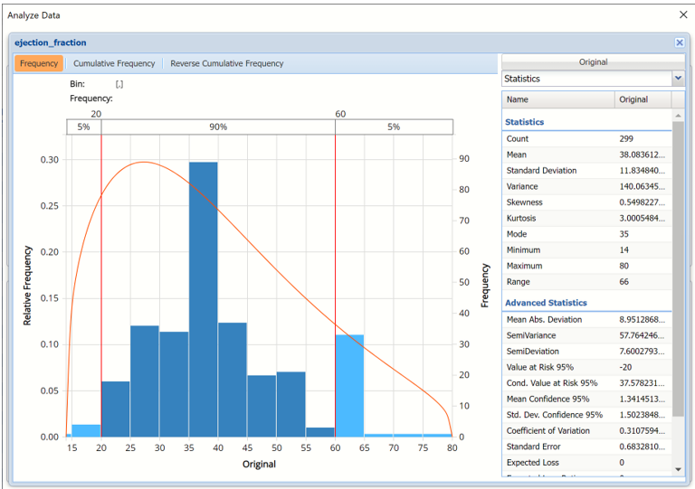
Double click any of the charts, for this example double click the original data ejection_fraction chart, to open a detailed, interactive frequency chart for the Original variable data.
Analyze Data dialog displaying original data for ejection_fraction variable.
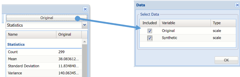
To overlay the generated synthetic data on top of the Original data, click Original in the upper right hand corner and select both checkboxes in the Data dialog.
Click Original to add Synthetic data to the interactive chart.
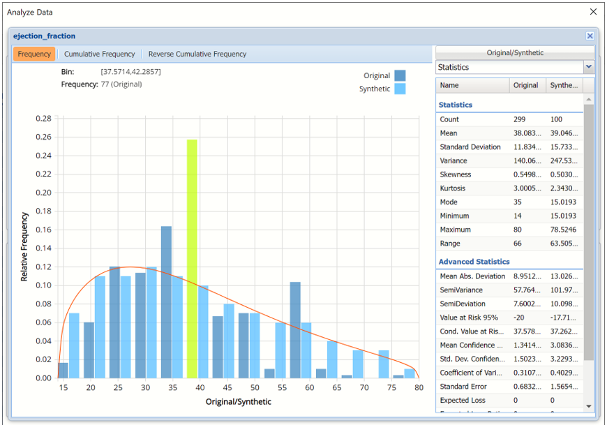
Notice in the screenshot below that both the Original and Synthetic data appear in the chart together, and statistics for both data appear on the right.
To remove either the Original or the Synthetic data from the chart, click Original/Synthetic in the top right and then uncheck the data type to be removed.
Analyze Data dialog shown with Frequency chart and Statistics displayed.
This chart behaves the same as the interactive chart in the Analyze Data feature found on the Explore menu.
- Use the mouse to hover over any of the bars in the graph to populate the Bin and Frequency headings at the top of the chart.
- When displaying either Original or Synthetic data (not both), red vertical lines will appear at the 5% and 95% percentile values in all three charts (Frequency, Cumulative Frequency and Reverse Cumulative Frequency) effectively displaying the 90th confidence interval. The middle percentage is the percentage of all the variable values that lie within the ‘included’ area, i.e. the darker shaded area. The two percentages on each end are the percentage of all variable values that lie outside of the ‘included’ area or the “tails”. i.e. the lighter shaded area. Percentile values can be altered by moving either red vertical line to the left or right.
- Click Cumulative Frequency and Reverse Cumulative Frequency tabs to see the Cumulative Frequency and Reverse Cumulative Frequency charts, respectively.
Analyze Data dialog shown with Cumulative Frequency chart and Percentiles displayed
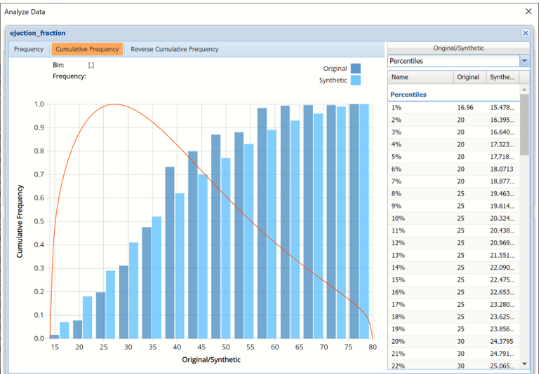
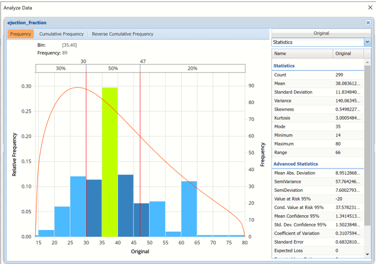
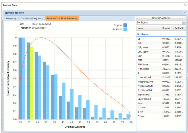
- Click the down arrow next to Statistics to view Percentiles for each type of data along with Six Sigma indices. Use the Chart Options view to manually select the number of bins to use in the chart, as well as to set personalization options.
Analyze Data dialog shown with Reverse Cumulative Frequency chart and Six Sigma indices displayed.
- Click the down arrow next to Statistics to view Bin Details for each bin in the chart.
Bin: If viewing a chart with a single variable, only one grid will be displayed on the Bin Details pane. This grid displays important bin statistics such as frequency, relative frequency, sum and absolute sum.
Bin Details View with continuous (scale) variables
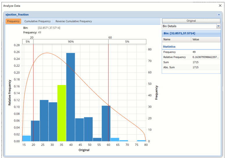
- Frequency is the number of observations assigned to the bin.
- Relative Frequency is the number of observations assigned to the bin divided by the total number of observations.
- Sum is the sum of all observations assigned to the bin.
- Absolute Sum is the sum of the absolute value of all observations assigned to the bin, i.e. |observation 1| + |observation 2| + |observation 3| + …
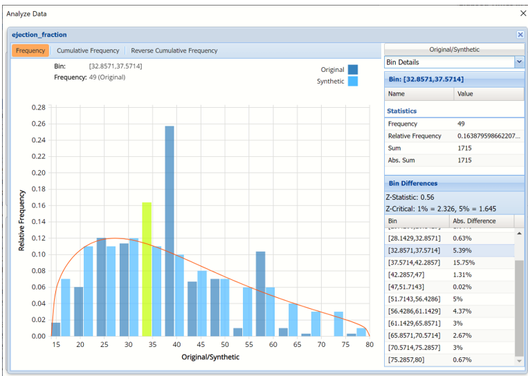
Bin Differences: If viewing a chart with two variables, two grids will be displayed, Bin and Bin Differences.
Bin Differences displays the differences between the relative frequencies of each bin for the two histograms, sorted in the same order as the bins listed in the chart. The computed Z-Statistic as well as the critical values, are displayed in the title of the grid.

As discussed above, see the Analyze Data section of the Exploring Data chapter for an in-depth discussion of this chart as well as descriptions of all statistics, percentiles, bin details and six sigma indices.
If something goes wrong…
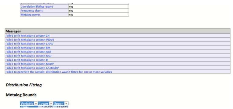
Any errors or warnings (i.e. that a Metalog distribution was not able to be fitted for one or more vars, correlation fitting failed, a sample could not be generated etc.) produced during data generation will be reported on the SyntheticData_Output worksheet in the Messages section, beneath Inputs.
If the error is not fatal, Generate Data tries to complete as many tasks as possible. For example, if all Metalog distribution fittings attempted were infeasible for at least one variable (more likely if Fixed is selected for Metalog Terms), Analytic Solver Data Science will continue with distribution fitting for all other variables and it will attempt to fit a correlation matrix (if requested). However, Analytic Solver would not be able to generate synthetic data since one feasible Metalog distribution for each variable is required in order to generate a sample. Or, if at least one feasible Metalog distribution for each variable is fit successfully but Analytic Solver Data Science fails to fit a correlation or copula, sample data will still be generated (if requested) but the sample will be uncorrelated.
The screenshot below displays multiple “Failed to fit” messages and one “Failed to generate the sample” error.
Failure messages as produced and reported by Generate Data